

Still writing...


2023

Ramsey Island Brewery needed to find a visual identity with which to start isolating itself in a busy beer marketplace. They are based in Essex, and aim to market themselves to the South East of England and an older rural customer base with limited craft beer experience. They are proud of their close relationship to sailing clubs and wished to convey that in the design.
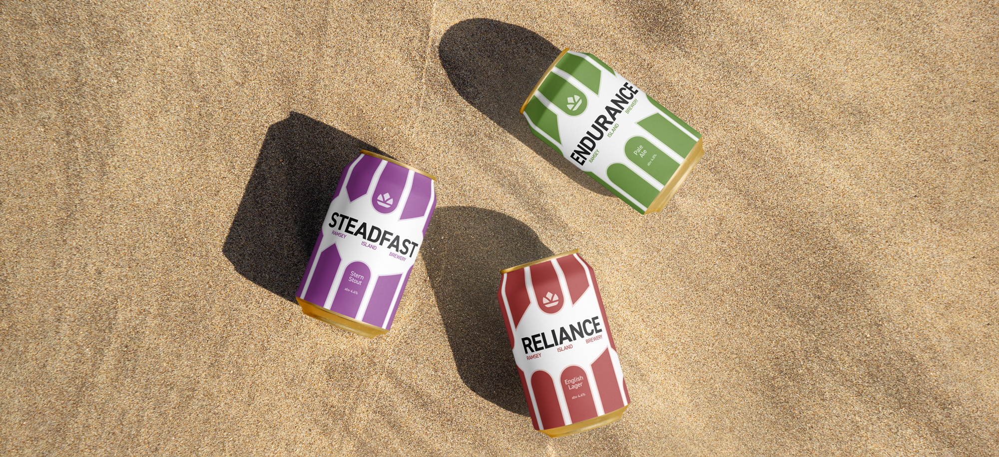
The solution incorperates design inspiration from the coastal cities and towns of England, along with distinct elements from British sailing heritage; there is a dominant use of bold, bright colour and shapes - directly taken from the sailing community's need to communicate at a distance by the use of semaphores and other tricks - such as razzle dazzle camouflage.
The solution incorperates design inspiration from the coastal cities and towns of England, along with distinct elements from British sailing heritage; there is a dominant use of bold, bright colour and shapes - directly taken from the sailing community's need to communicate at a distance by the use of semaphores and other tricks - such as razzle dazzle camouflage.
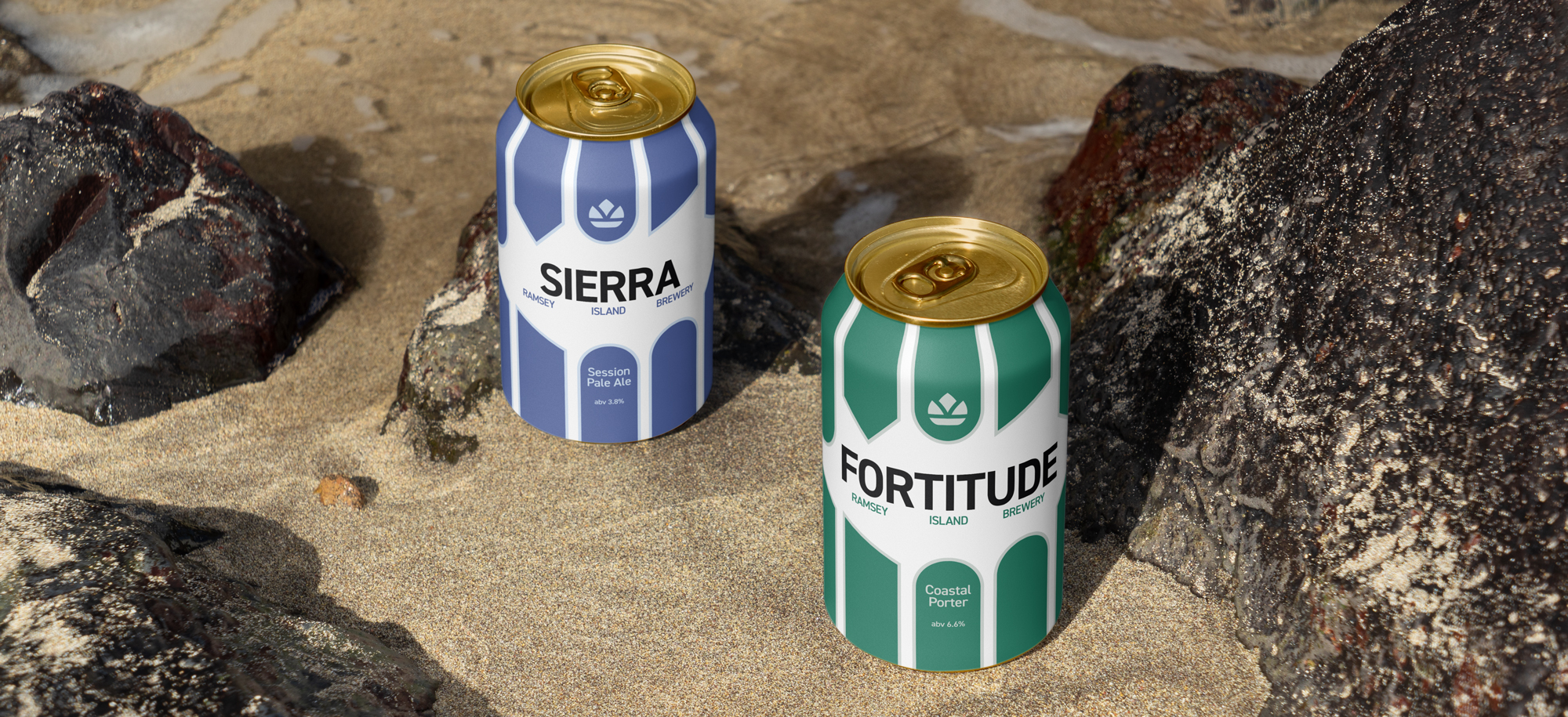
The design uses vertical bars - ending in unique shapes - as a way to frame the name of the beer and give a focal point to the design; making the most of the bold colours' ability to isolate and help the name of the beer stand out amongst competitors on the shelf.
2021

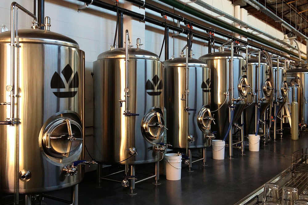
Ramsey Island Brewing Company is a small company based in the heart of Essex county on the banks of the Blackwater Estuary. It was established by three school friends in 2018 after taking an interest in homebrewing beer alongside doing their A Levels. The homebrew setup grew larger and eventually moved out to Essex where there was family and, crucially, more space to expand.
Ramsey Island needed a transmissable logo to help their brand and packaging stand out amongst the competitors. They are proud of their location and wanted their community to be a main consideration for the logo. They have strong ties to a local sailing club and are themselves based on the banks of the Blackwater Estuary - this meant it was important to consider their love of sailing in the logo.
Ramsey Island needed a transmissable logo to help their brand and packaging stand out amongst the competitors. They are proud of their location and wanted their community to be a main consideration for the logo. They have strong ties to a local sailing club and are themselves based on the banks of the Blackwater Estuary - this meant it was important to consider their love of sailing in the logo.
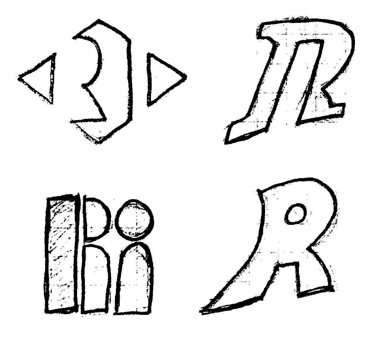
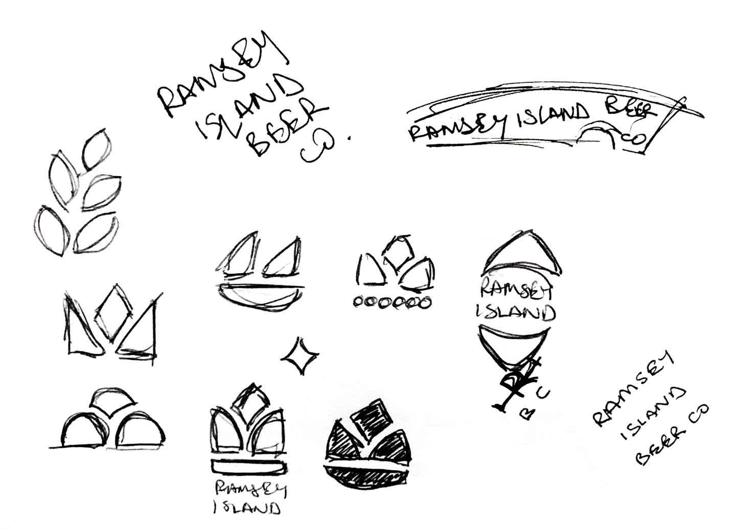
The initial logo development involved fast-paced sketching to explore the possibilities of wordmarks, initials-based logos or standalone icons. Once there was enough options to explore, the next step was to vectorise and test on mockups to visualise how the solution might work in reality.


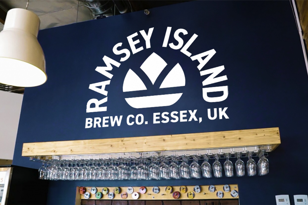
The solution for Ramsey Island was a logo that would show off the things about themselves of which they were most proud. These elements are the quality of their ingredients and their tight relationship with the local sailing club. The icon was developed by researching crowns, the shapes of hops, and the profile of a sailboat.
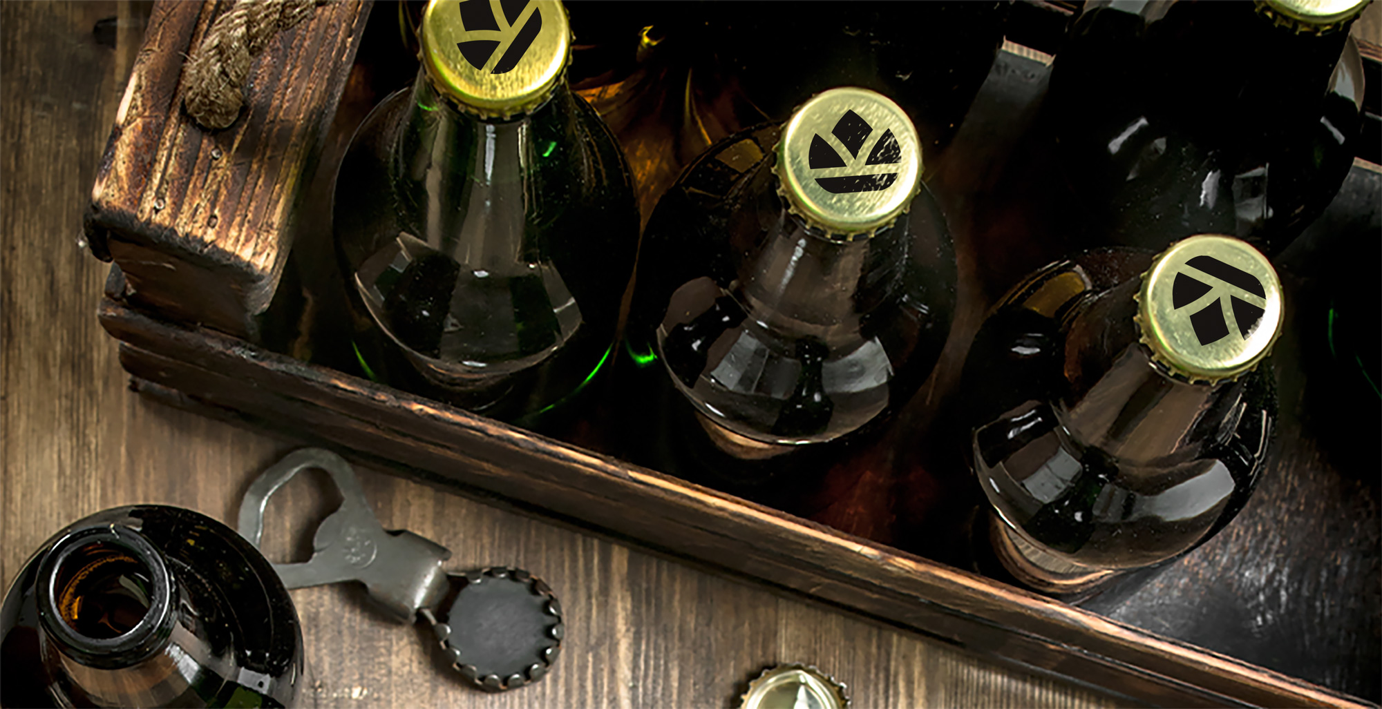
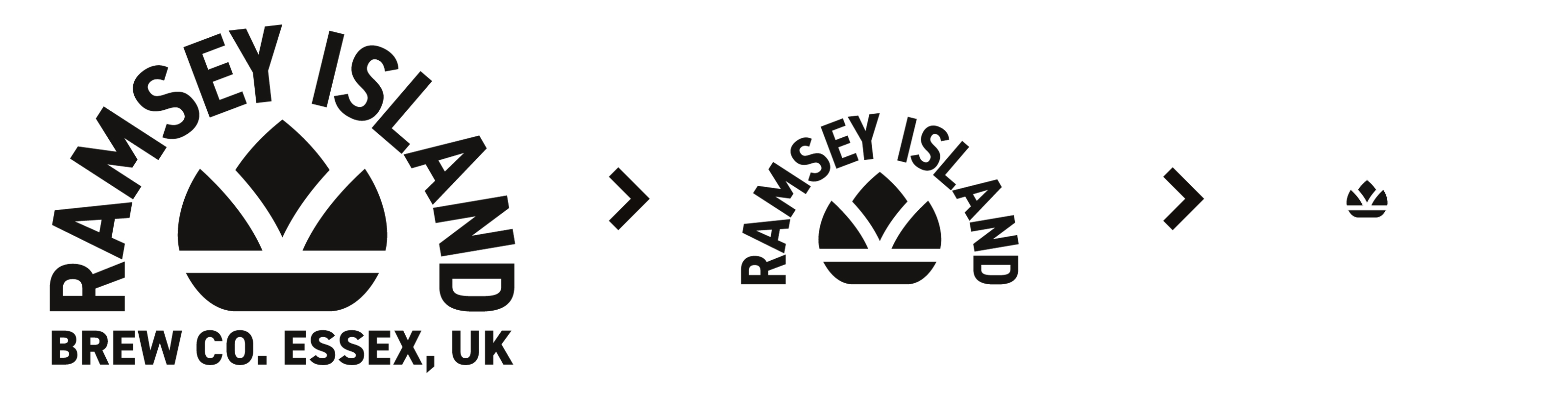
As the logo is applied to smaller and smaller forums - such as on tees and other merchandise - it sheds the text to improve legibility. When reduced even further, the text is removed entirely and gaps between the four elements of the icon increase in size to improve clarity as it is readied for application in places such as bottle caps and as a website favicon.
As the logo is applied to smaller and smaller forums - such as on tees and other merchandise - it sheds the text to improve legibility. When reduced even further, the text is removed entirely and gaps between the four elements of the icon increase in size to improve clarity as it is readied for application in places such as bottle caps and as a website favicon.
2021
Tomato Development is a property development company based in London. They have worked on a number of projects in London and the West Midlands.
Tomato needed a clean, modern and recognisable logo to represent the company in all media output. It needed to stand out from its competitors, and give some indication to being a property development company. It had to symbolise structure and stability, but also confidence, professionalism and trust. The icon would ideally have some link to the history of the company, which was made using the names of the founder’s three sons.
The logo produced for them was a simple icon and wordmark combination; it stands for a lot of things - fundamentally building blocks, but also organised in a way to appear like a trilothon and, in the negative space, a capital ‘T’. It also has a relationship with the name of the company, Tomato, which is made up of the first two letters of each of the three sons of the company’s founder.
The typeface used for the wordmark is Gilroy, a modern sans serif which combines modernity, legibility and geometric precision to the logo.

2021
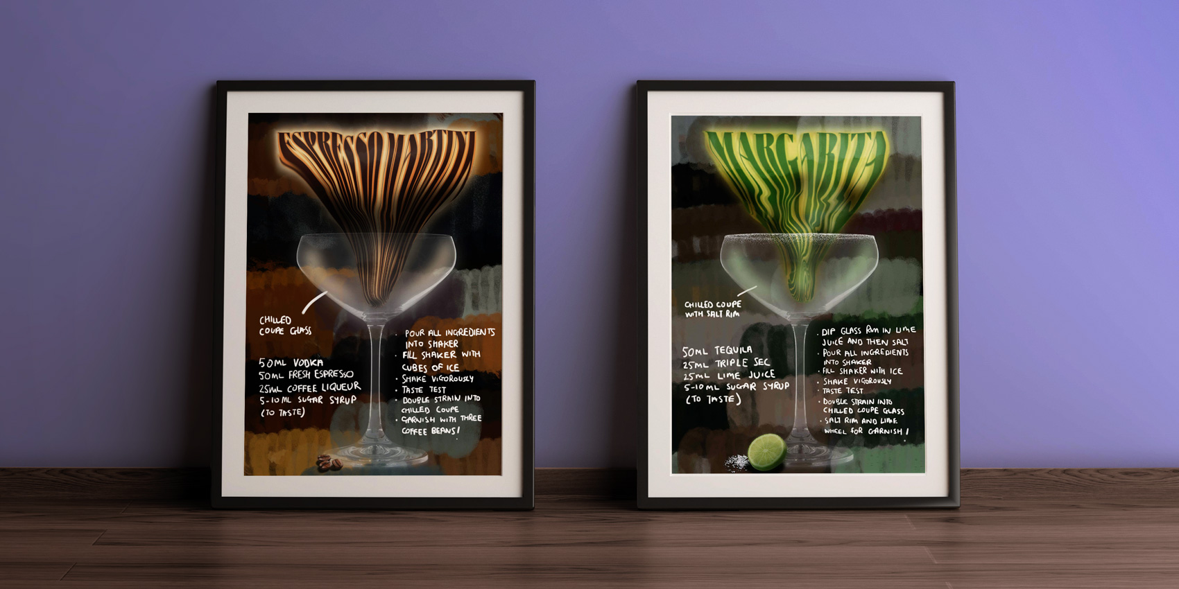
During the COVID-19 Lockdown in London, these posters came as a result of completing an online Photoshop course. This poster series is an attempt to solidify these news skills and an understanding of specific tools whilst carrying out a personal project. The series is made for people who need instructions on how to make certain cocktails to a professional standard and could also serve as wall decoration for a cocktail bar.
Skills used:
Skills used:
- Liquify Tool (Wacom Tablet)
- Brush Tool (Wacom Tablet)
- Adjustments Panel (Levels, Brightness/Contrast, Hue/Saturation)
- Blending Modes
- Clipping Masks
- Select Subject
- Pattern Stamp Tool
2020