

This brief was set by the British Museum Anthropology Library and Research Centre. It asked students to find a way to bring in visitors who might be interested in using the facilities available to people who might not know about it. It is not a part of the Museum that wants as many people using it as the rest of the museum because it would easily become overcrowded; they only want to bring in people who might find the library of use.
My outcome was a small zine called In Context, In Contrast; which used the images in the library as a summary example of the contents they had. While the library possessed mainly texts, this would not have grabbed the interest the same way visuals would. I used the visuals as an informative product to show what content is available, and to also show what can be done with it.
My outcome was a small zine called In Context, In Contrast; which used the images in the library as a summary example of the contents they had. While the library possessed mainly texts, this would not have grabbed the interest the same way visuals would. I used the visuals as an informative product to show what content is available, and to also show what can be done with it.
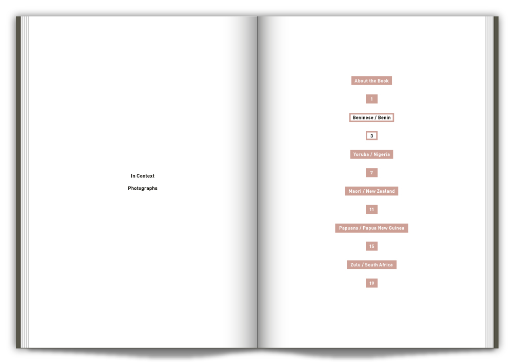
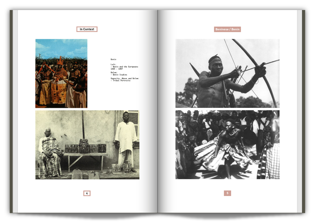


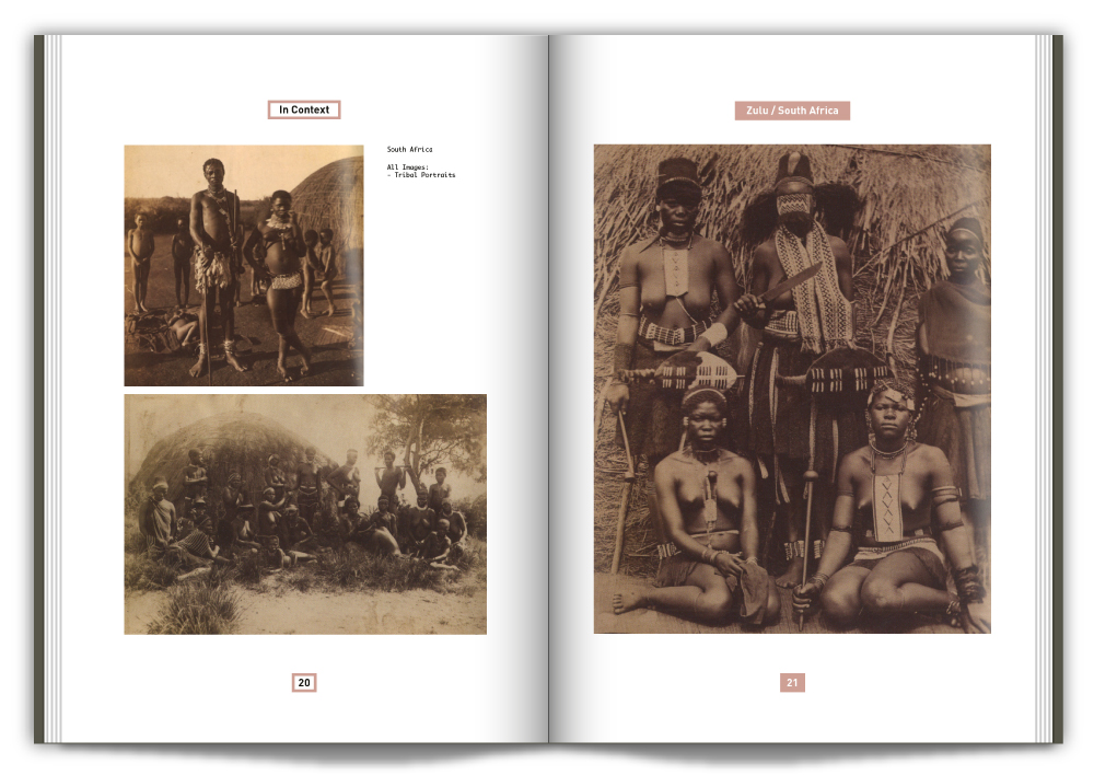

All of the spreads in ‘In Context’: Showing photos


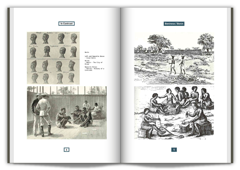


All of the spreads in ‘In Contrast’: Showing Illustrations
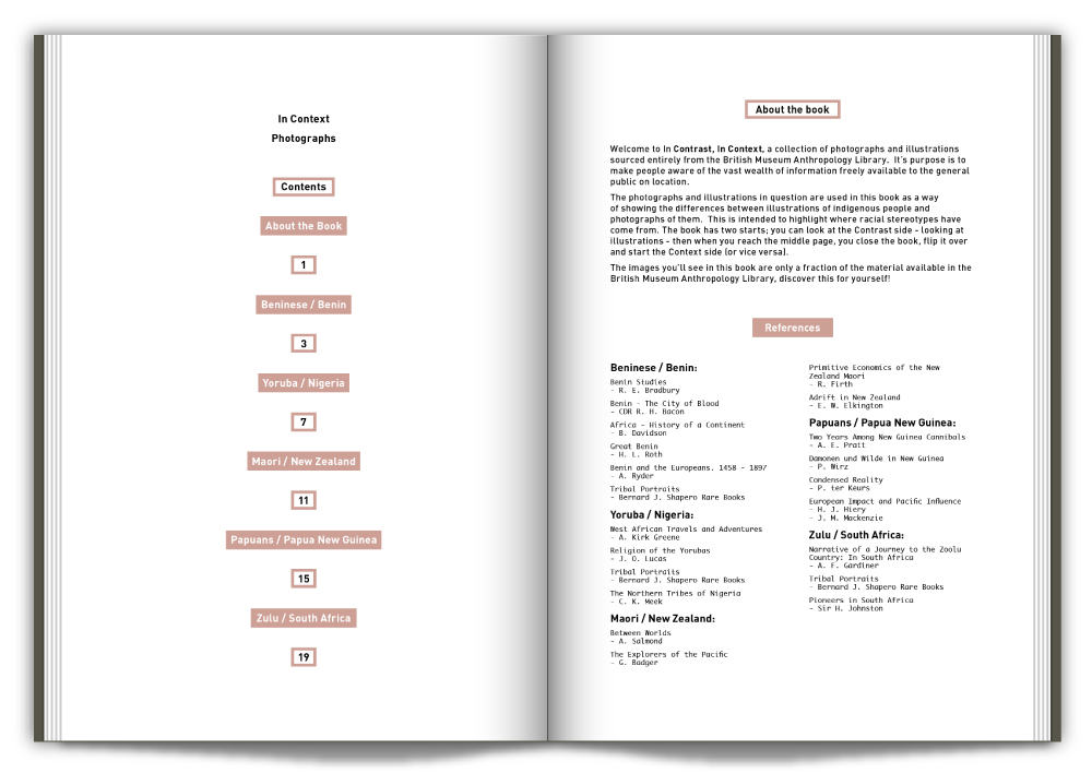
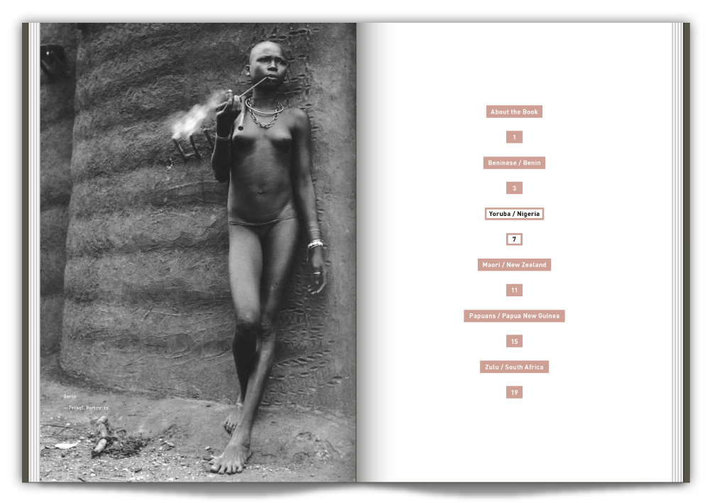
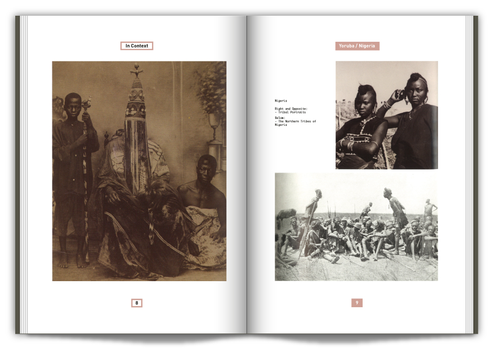
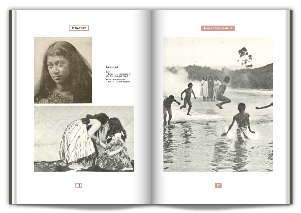
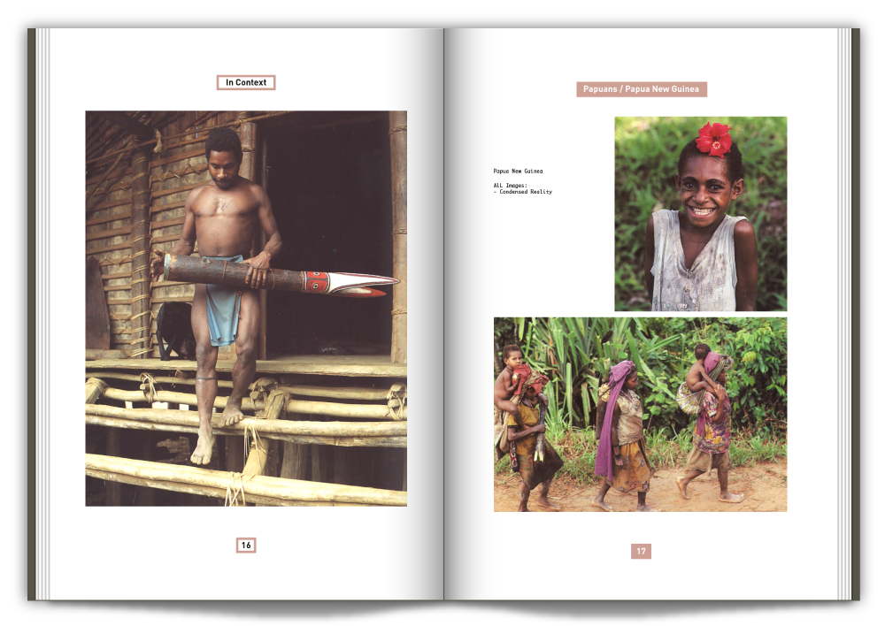
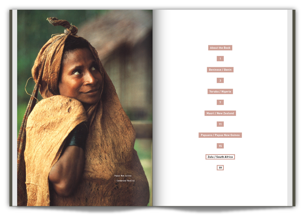
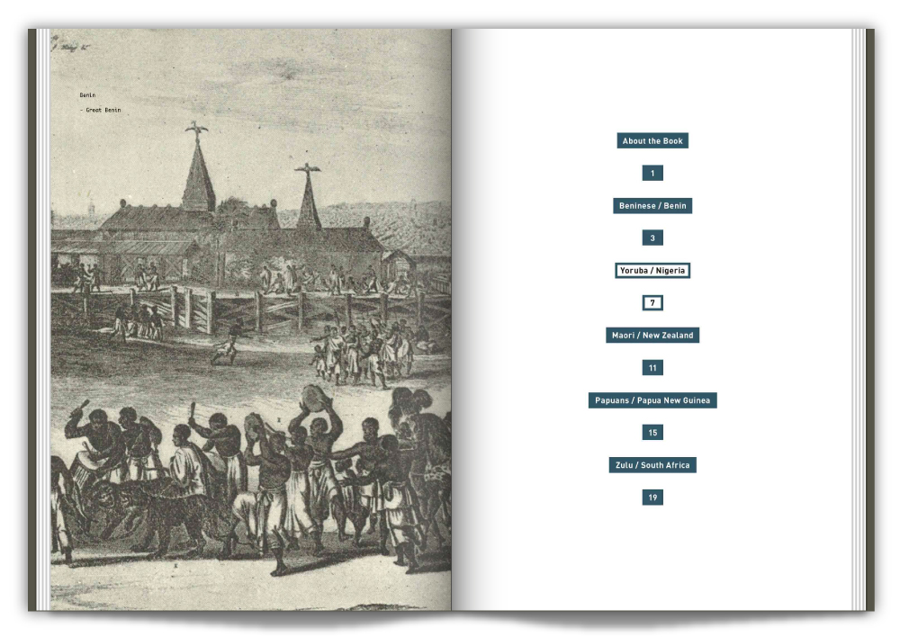
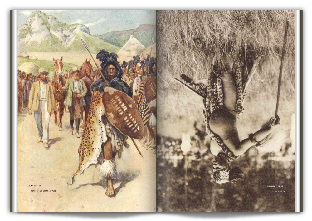
In Context, In Contrast is a collection of photographs and illustrations sourced entirely from the British Museum Anthropology Library. It’s purpose is to make people aware of the vast wealth of information freely available to the general public on location.
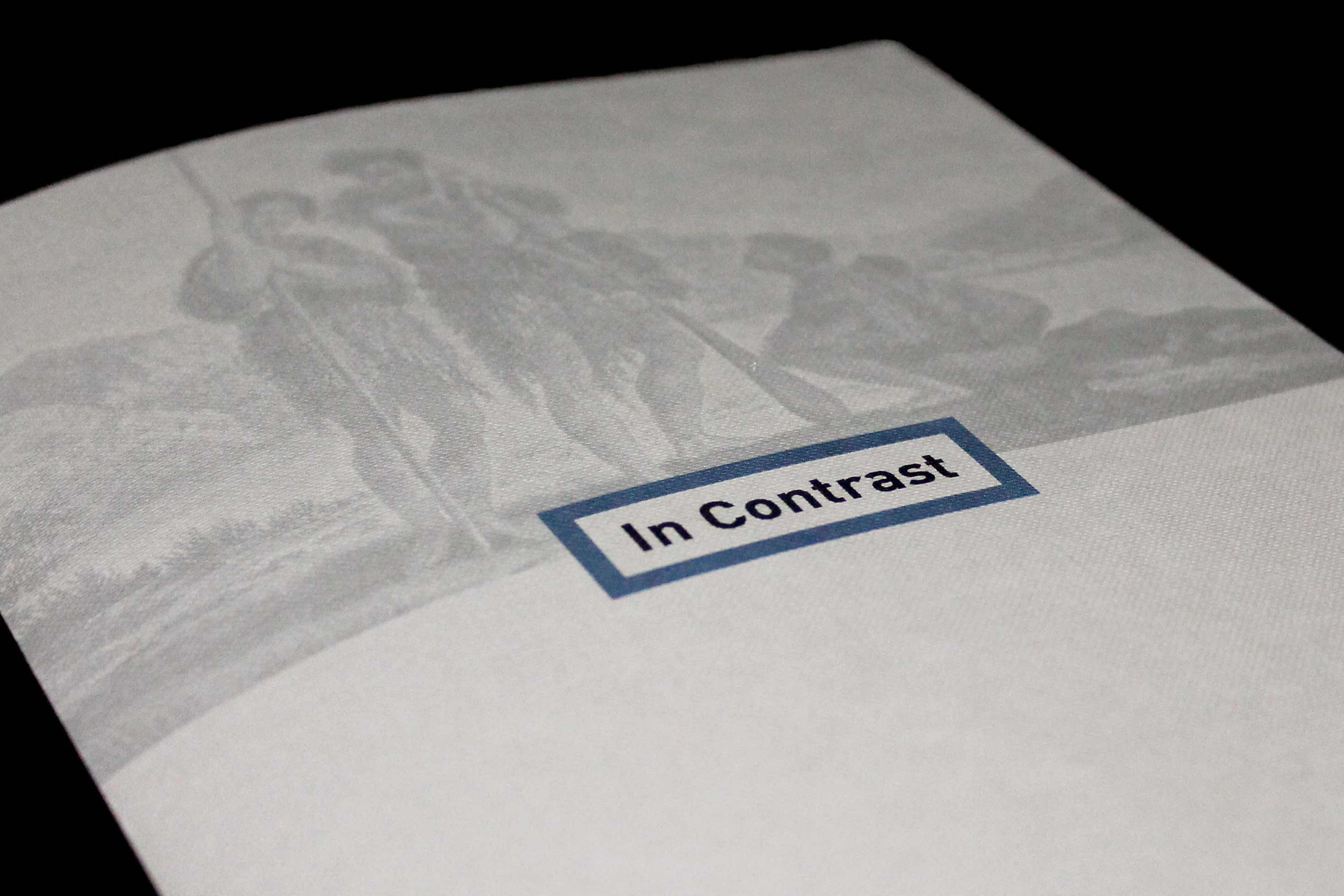
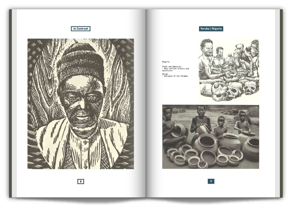
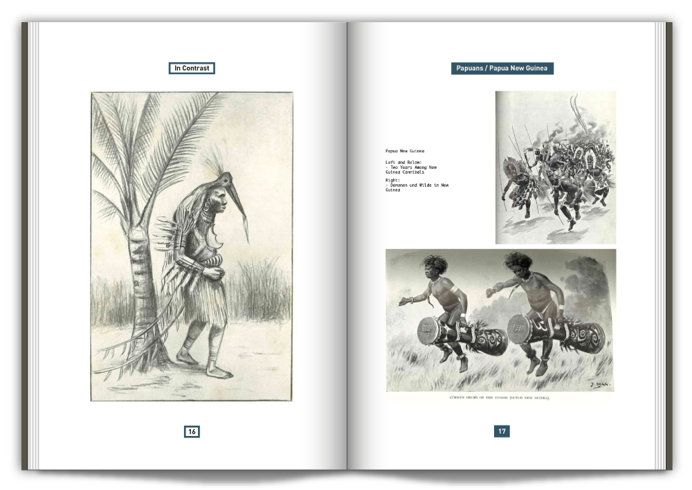
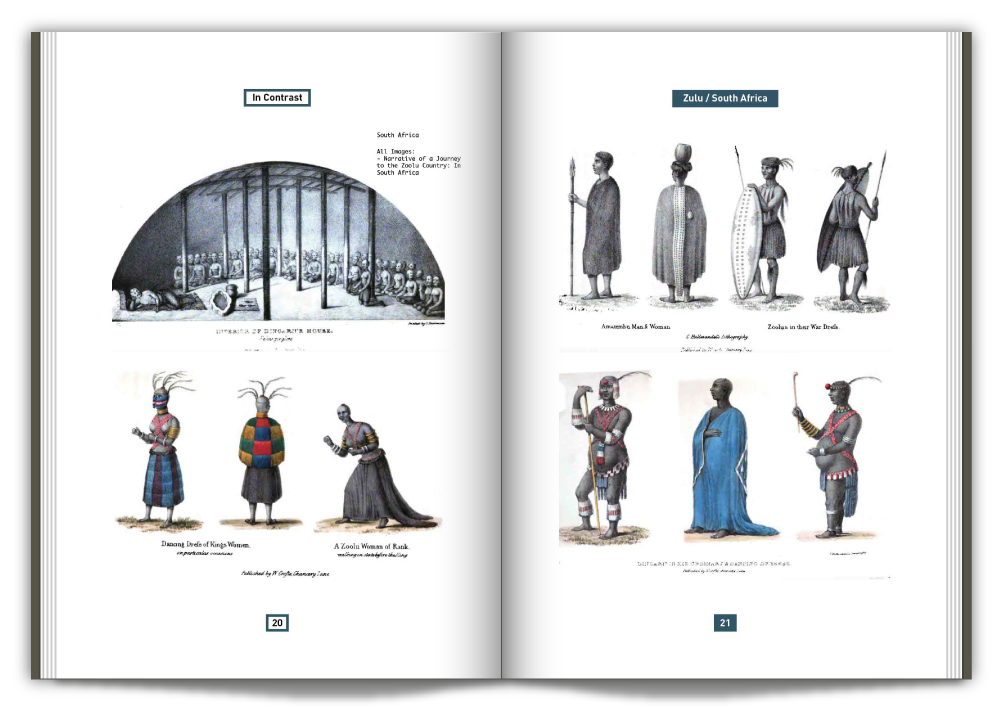
The photographs and illustrations in question are used in the book as a way of showing the differences between illustrations of indigenous people and photographs of them. This is intended to highlight where racial stereotypes may have come from. the zine has two front covers and can be started at either ‘In Context’ or ‘In Contrast’. The idea came from a clothing shop lookbook, which used the same approach for Men’s and Women’s clothing.
The photographs and illustrations in question are used in the book as a way of showing the differences between illustrations of indigenous people and photographs of them. This is intended to highlight where racial stereotypes may have come from. the zine has two front covers and can be started at either ‘In Context’ or ‘In Contrast’. The idea came from a clothing shop lookbook, which used the same approach for Men’s and Women’s clothing.
2016