
For this editorial project I looked at Le Corbusier and specifically his Unité D’Habitation architecture. The editorial is intended to embody his work and style as much as possible and as I was looking at Le Corb’s Unités I had an interesting task of combining the use of material and colour.


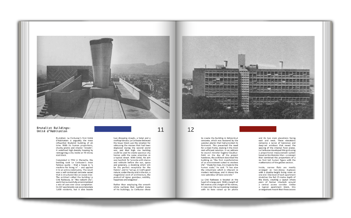


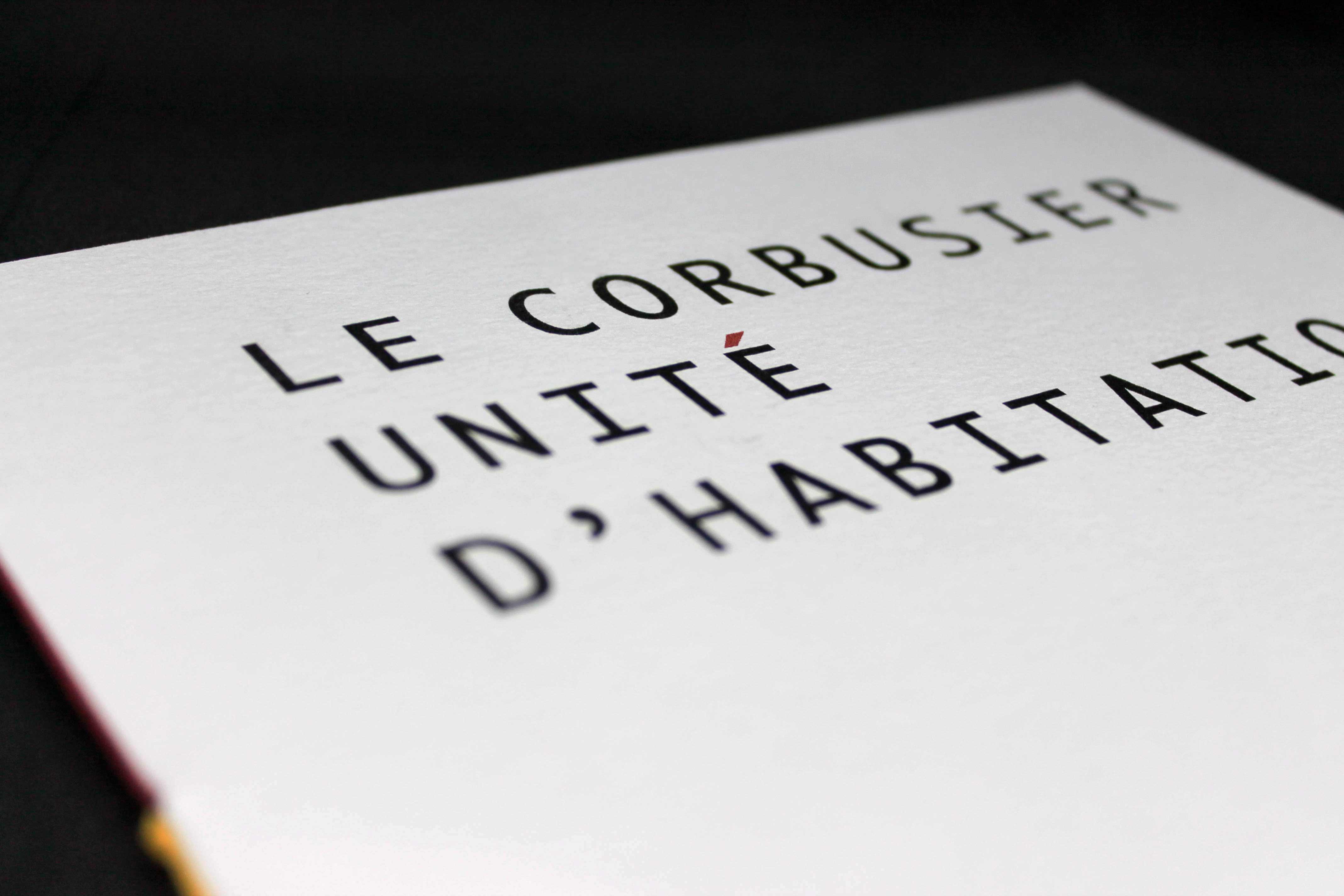
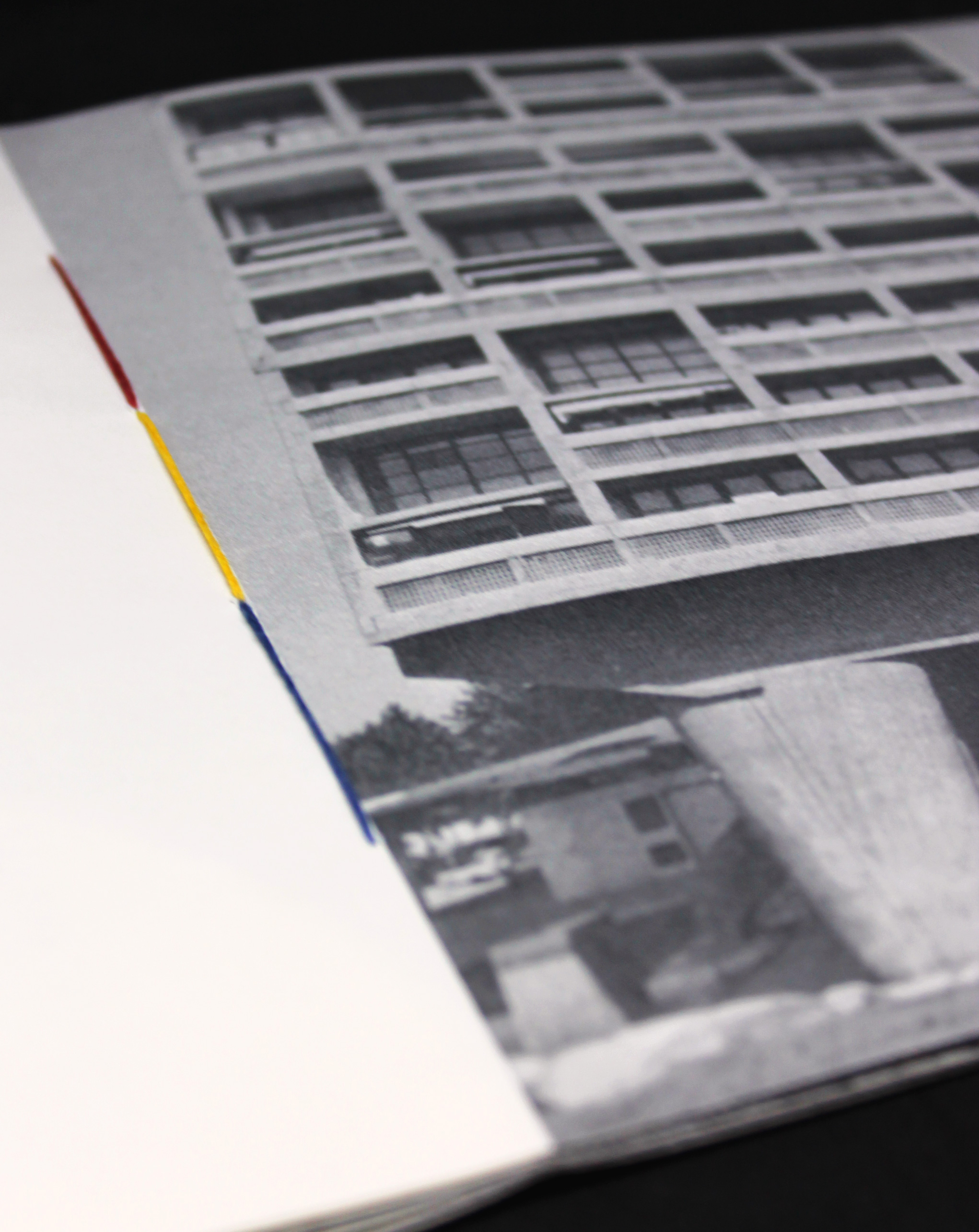
The Unités are made by pouring concrete into wooden frames and as a result the outside of the building bears a relief showing the grain of the wood and the gaps in its assembly - I chose a rough, heavy, off-white paper to show this. The building also has plenty of colour spotted all over its facade on each of the apartments; this inspired the use of colour in the binding, throughout the presentation of the texts and on the accent egout (É) on the front cover.
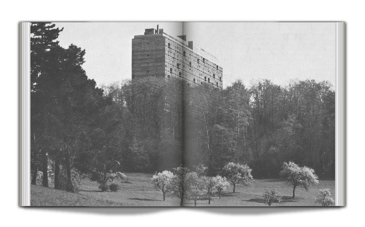
To keep a Brutalist aesthetic, the paper used gives the reader a feel of the architectural style and some of the images inside are scanned high resolution from a book on the architect - but printed in black and white and bitmap to give a more hostile look to the pages.
To keep a Brutalist aesthetic, the paper used gives the reader a feel of the architectural style and some of the images inside are scanned high resolution from a book on the architect - but printed in black and white and bitmap to give a more hostile look to the pages.
2015